Takhfifan is a local experience marketplace intended to offer various services at discounted prices in Iran similar to Groupon and Fave. Takhfifan’s key offerings include in-store payments, online/offline cashback, and other offers that help users save more.
Summary:
In summary, I analyzed the qualitative and quantitative data to address the problem and realize why people struggle in the deal purchase flow, revamped the user experience and redesigned the Final UIs.
My role:
As the Product designer and UX researcher, I collaborated with the data science team, marketing team, and also product managers of different business lines throughout this project.
Impact:
Data showed that compared with the previous version of Category and vendor detail pages, new designs increased the overall conversion rate by +46.7% and reduced the average bounce rate by -22%.
+0%
Overall conversion rate
-0%
Average bounce rate
In this project we focused on the PWA mobile version of the product as 88% of the traffic is from mobile devices compared to 12% from desktops.
Why redesign?
A quantitative data analysis of the last 90 days from “Google Analytics” and “Metabase” along with qualitative research data from usability studies, interviews, heatmaps, and session recording analysis, revealed several issues in the deal purchase flow of the product. in summary, these were the key reasons for the redesign:
Low conversion rate of the deal purchase flow An exceptionally low conversion rate indicates serious friction in the deal purchase flow.
High bounce rate of the high-traffic product pages A high average bounce rate in the high-traffic product pages signals that the main product pages are failing to engage users.
Usability problems and unclear paths Further Feedback from usability studies and session recording analysis revealed major usability issues in the purchase flow, causing users to become frustrated during their journey.
Goal & objectives
🎯 Business goals:
The main business goals were to increase the overall conversion rate and reduce the average bouncerate on the deal purchase flow in the product.
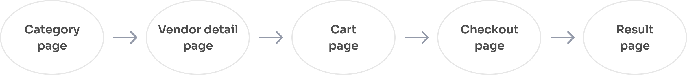
General deal purchase user flow
📝 Redesign objectives:
Identify Where the problem occurs in the user journey?
Identify Why users struggle in their journey?
Redesign and fix user experience issues & suggest areas of improvement of the flow.
Add new business features.
My approach
How I approached the problem:
After I gathered initiative data from analytics tools, product managers, and stakeholders, I followed these steps to identify where is the problem and why users struggle with the purchase flow. I pursued two core objectives:
Identifying whereissues occur?
Used Google Analytics and Metabase reports to identify drop-off rates within the deal purchase journey.
Analyzed Microsoft Clarity session recordings and heatmaps to spotlight usability issues within that journey.
Understanding whyusers struggle?
Conducted 1:1 moderated usability study with 9 participants matching target user demographics.
Interviewed each usability test participant afterward to probe pain points further.
Where?
MC recordings and heatmaps
GA and metabase data
Why?
Moderated usability study
User interview
Quantitative data analysis
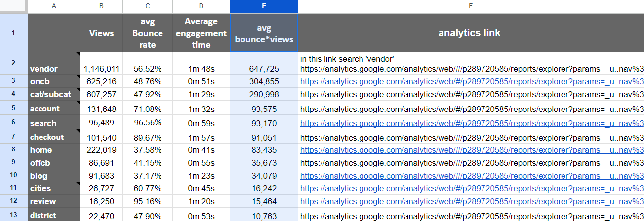
1. Metabase and Google Analytics data
We began by working closely with the product managers and marketing team to gather quantitative data. Our goal was to identify the pages with the highest bounce rates and page views and prioritize which ones to address first. To achieve this, we extracted average bounce rate and page view data for different product pages over the last 30 days using Google Analytics and Metabase.
⚠ Insight
According to the general deal purchase user flow, as an insight, we concluded that we should focus on redesigning “Vendor detail pages” and “Category pages”.
2. Funnel analysis
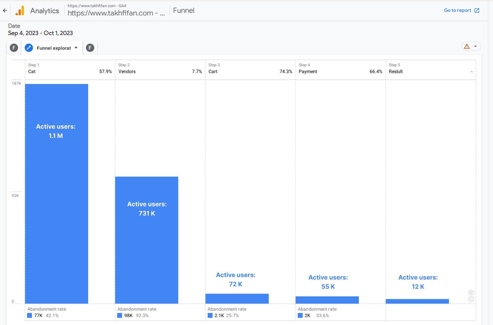
I also dug deeper into the quantitative data by leveraging Google Analytics to map a deal purchase funnel spotlighting key phases in the product’s purchase pathways over the last 30 days.
⚠ Insight
As you can see in the photo above, we realized that the main issues with conversion rate are on the category and vendor detail pages.
92.3%
Vendor detail pages
abandonment rate
42.1%
Category pages
abandonment rate
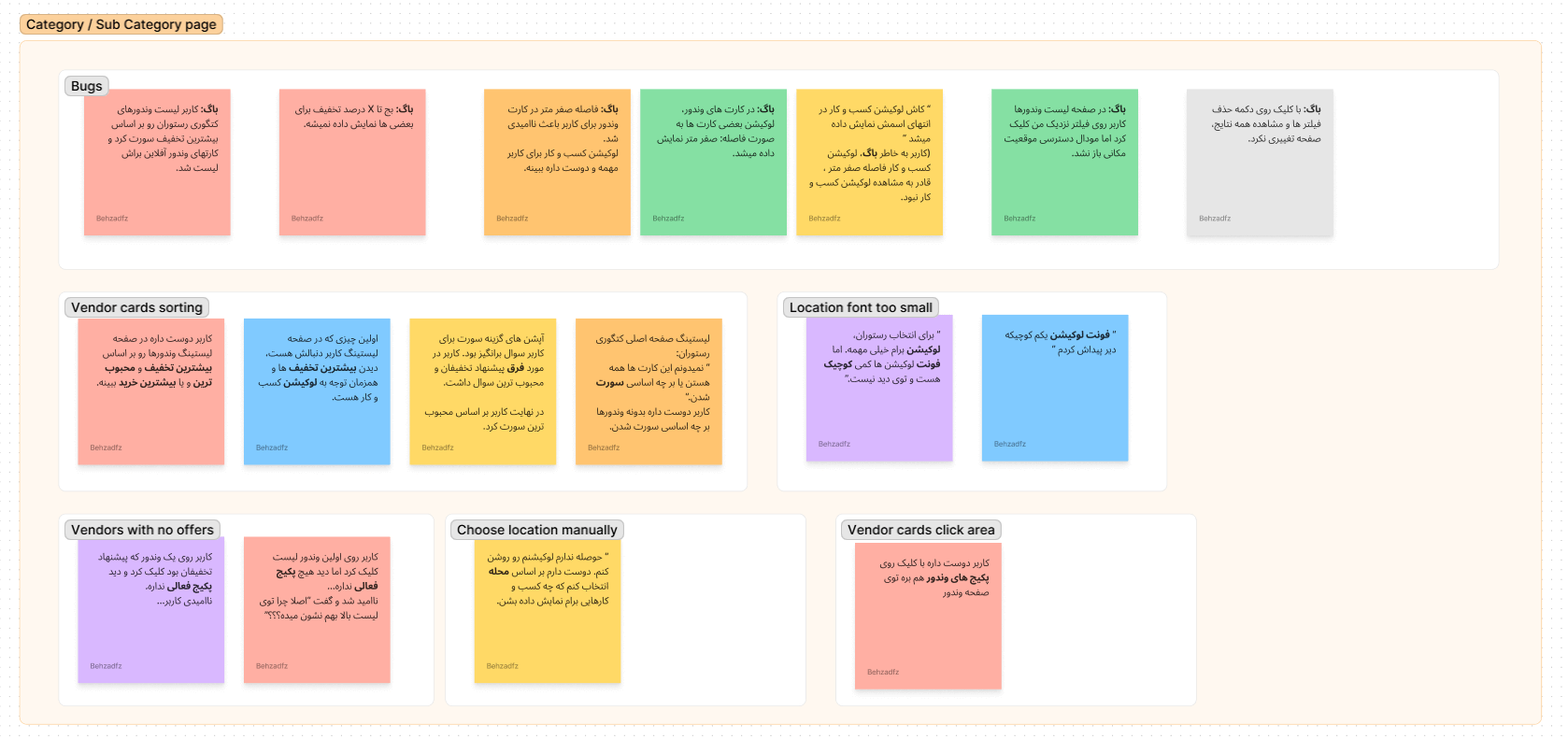
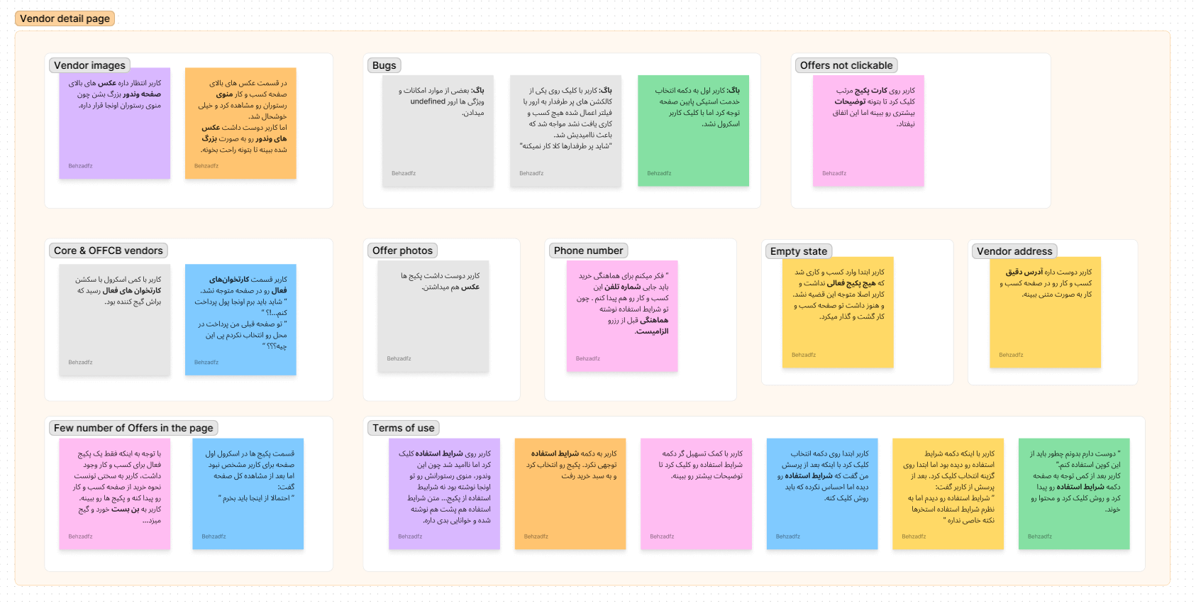
Qualitative data analysis
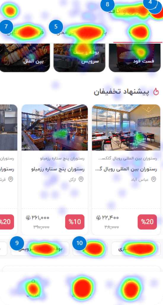
I also utilized Microsoft Clarity to analyze user session recordings and clickstream heatmaps over the last 30 days. This helped me identify pain points and issues that users may be facing on these pages. Three main insights were:
Insight #1
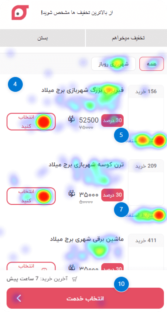
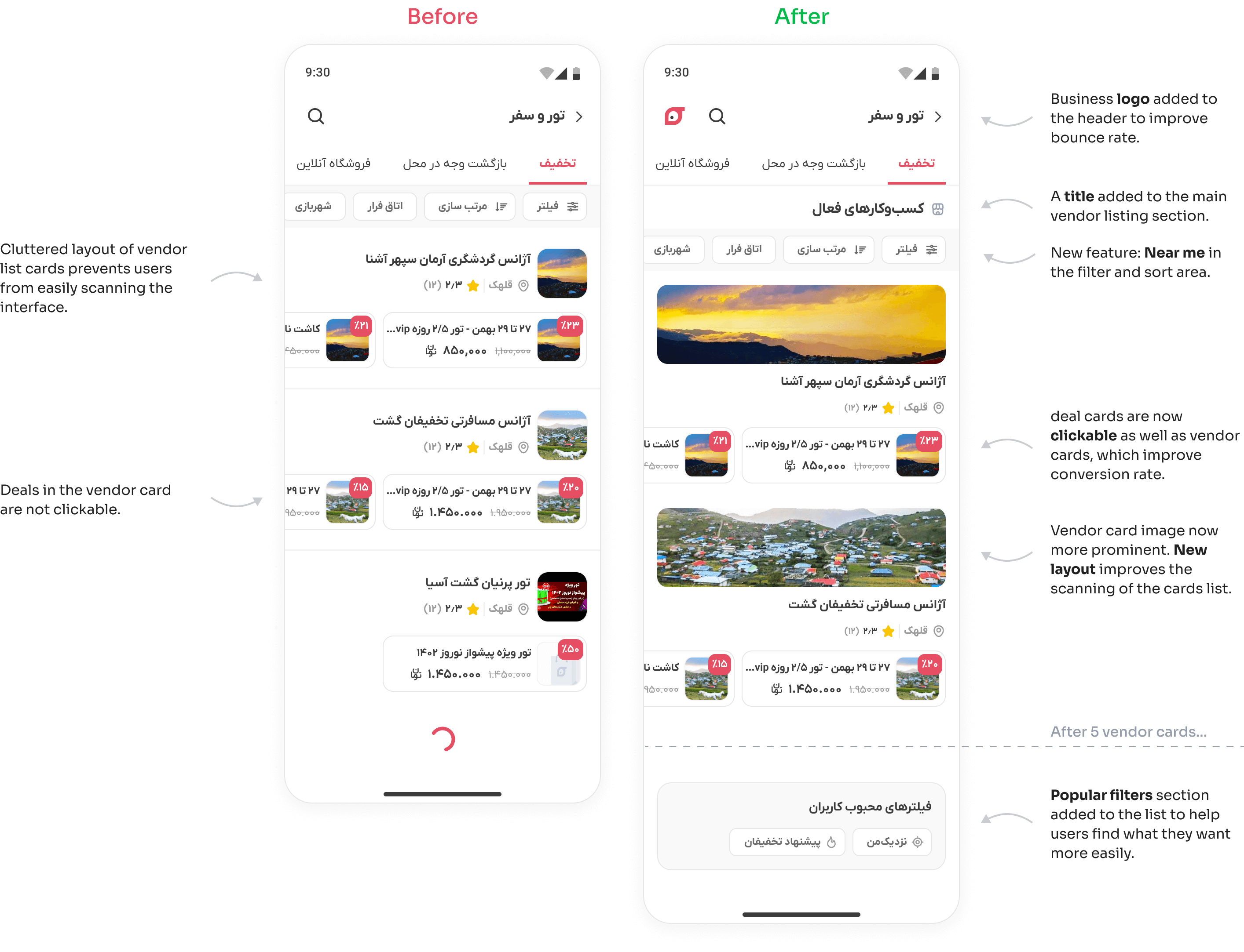
Deal cards provide no extra information about the voucher
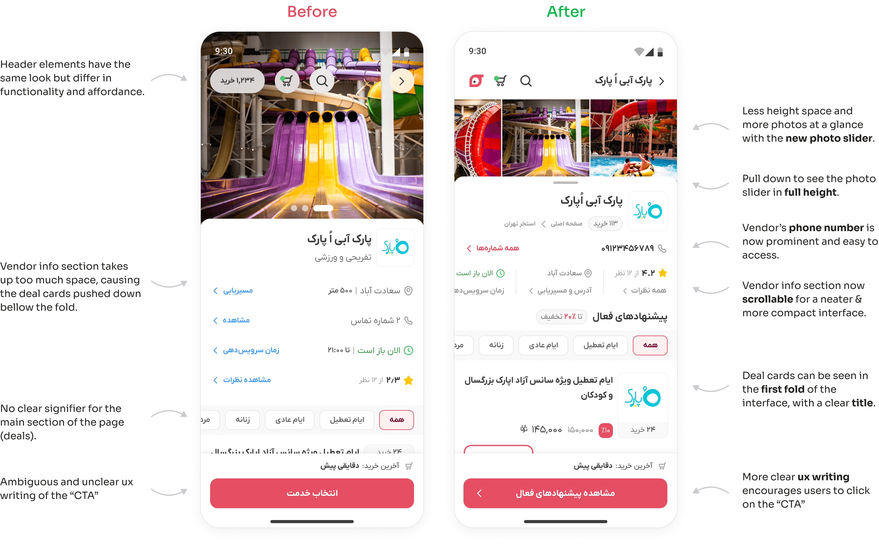
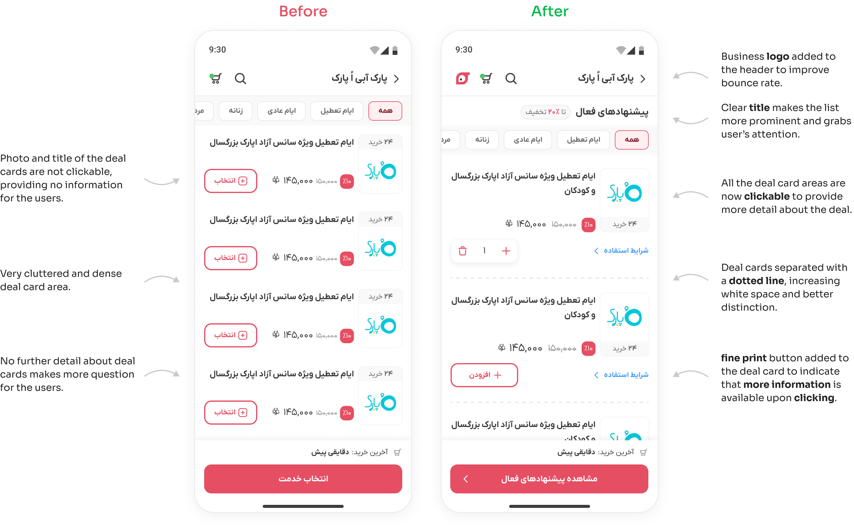
Heatmaps and video recordings show that many users click the title and generally the whole card, but nothing is clickable, except CTA, which leads to user frustration.
Insight #2
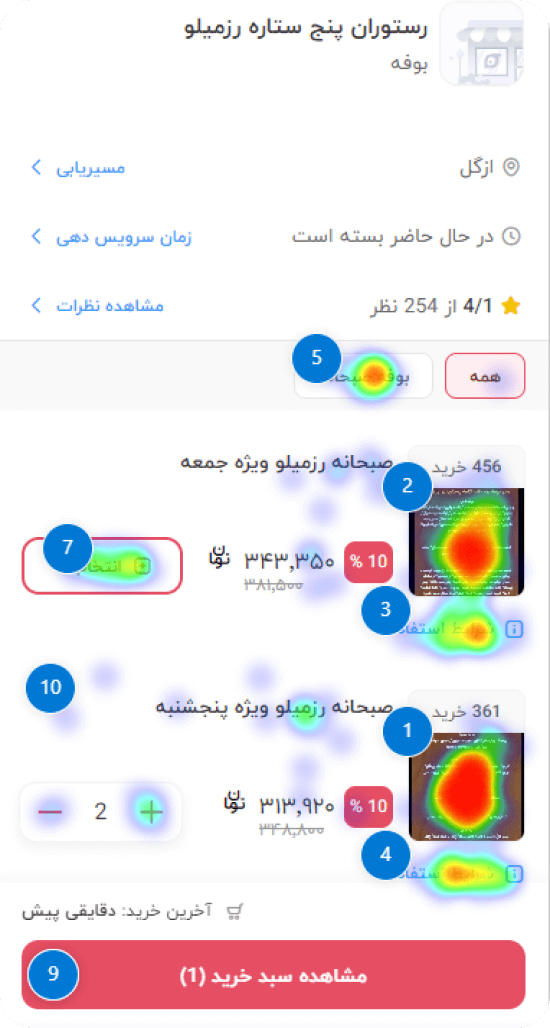
Filter and sort content are irrelevant or not functioning
Heatmaps and video recordings show that filter and sort options are very popular, but video recordings demonstrate that either the content is irrelevant or simply just doesn’t function properly. This leads to user frustration and leaving the page.
Insight #3
Deals on vendor cards are not clickable
Heatmaps and video recordings show rage clicks on deal cards on the category page but they are not clickable.
Usability study & Interview
To understand why users struggle on “Vendor detail pages” and “Category pages” in the deal purchase journey, I conducted a moderated in-person usability study. During the study, participants were given several tasks to perform. After analyzing the results, I carried out a redesign based on the insights obtained. I also interviewed each participant afterward to probe pain points further.
1. planning the study
👥 Participants
8 participants who had minimum prior experience with the product.
✔ Methodology
Moderated in-person usability study
⚙ Process
planning the study
Conducting the study
Organizing the data and finding patterns
Offering insights and recommendations
🎯 Goals
Measuring the usability of the deal purchase journey
Identifying user’s pain points in achieving their goals
Identifying areas of improvement in the user experience
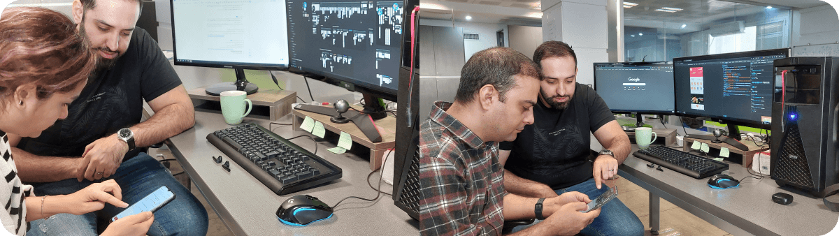
2. Conducting the study
Going to the participant’s location to conduct the study.
Explaining the purpose of the research, session rules, and having ice breaker conversations.
Reminding the user to think aloud during the session and that we are looking for honest answers and there are no right or wrong answers.
Starting the study based on the interview script and asking the user to perform the tasks.
Taking quick notes on observations, quotes, SEQ scores, and also recording the user’s voice during the session.
Thank the user for participating in this study.
3. Organizing the data and finding patterns
All the observations, quotes, questions, SEQ scores, and other study information were gathered into sticky notes using Figjam. Then similar and frequent problems of the participants were identified as themes (patterns), using the affinity diagram method.
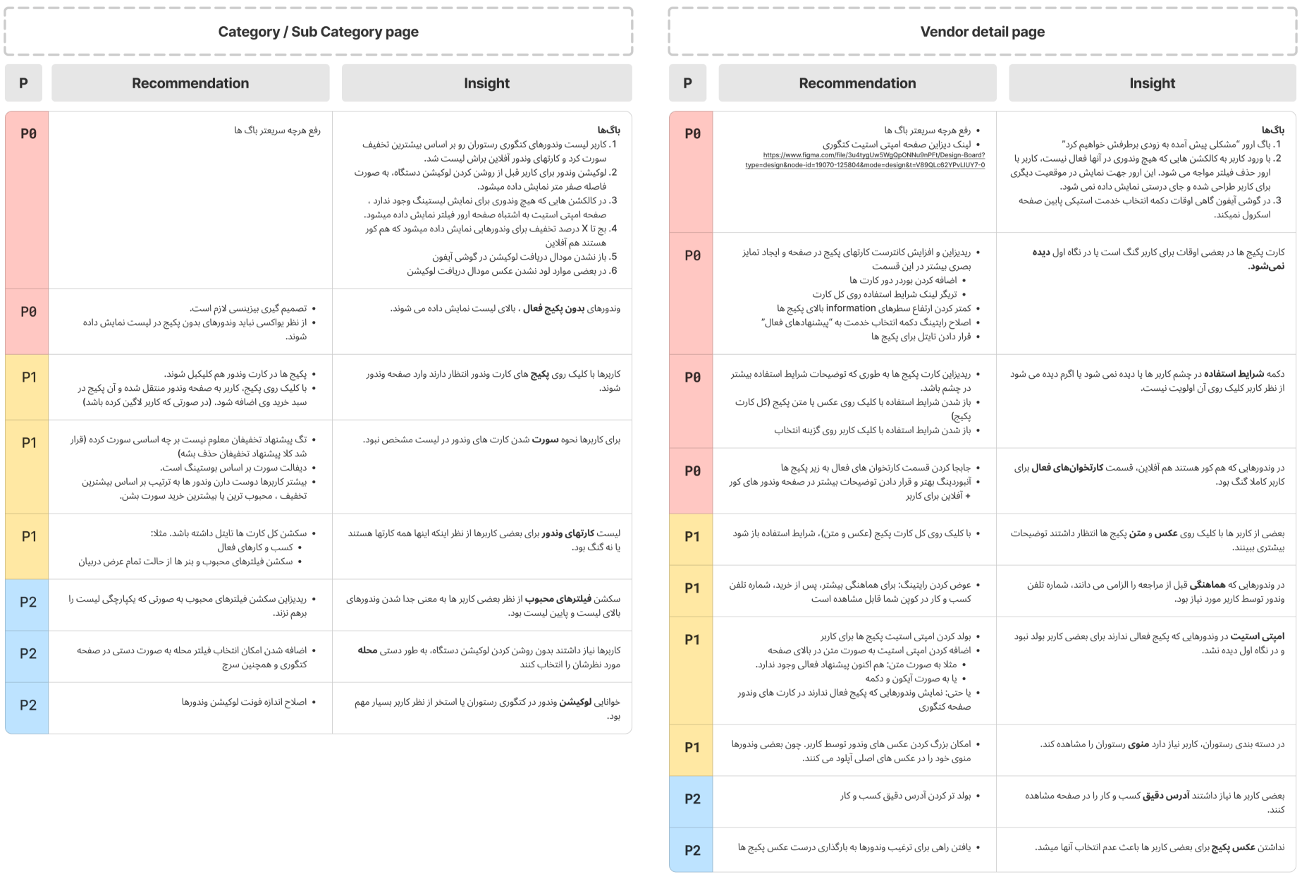
4. Offering insights and recommendations
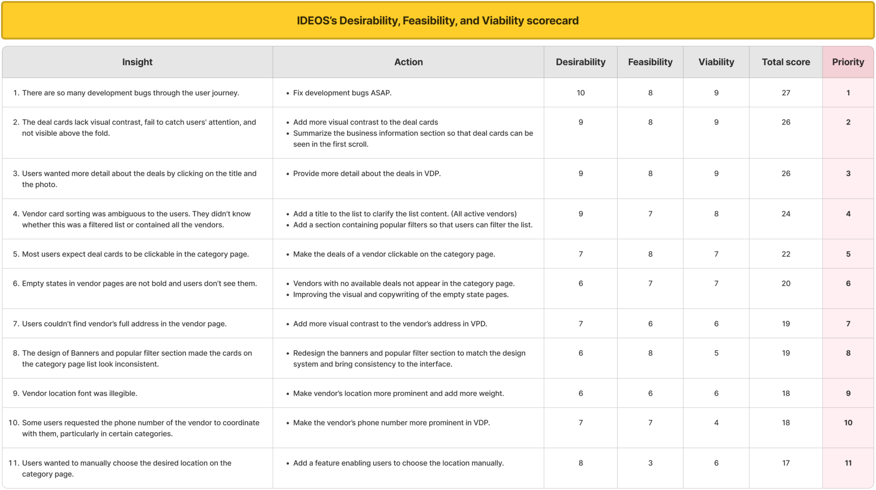
I presented a list of all the insights obtained from the usability study and related recommendations in a stakeholder review session. I also proposed my own view of prioritization to solve the issues step by step. (P0, P1, and P2)
Prioritizing research results
After analyzing both qualitative and quantitative data, we held a stakeholder review session to discuss the findings. During this session, we decided to perform a more detailed prioritization method in order to begin the redesign and then the development phase. To achieve this, I utilized the IDEO’s Desirability, Feasibility, and Viability scorecard method to more accurately prioritize the recommended actions.
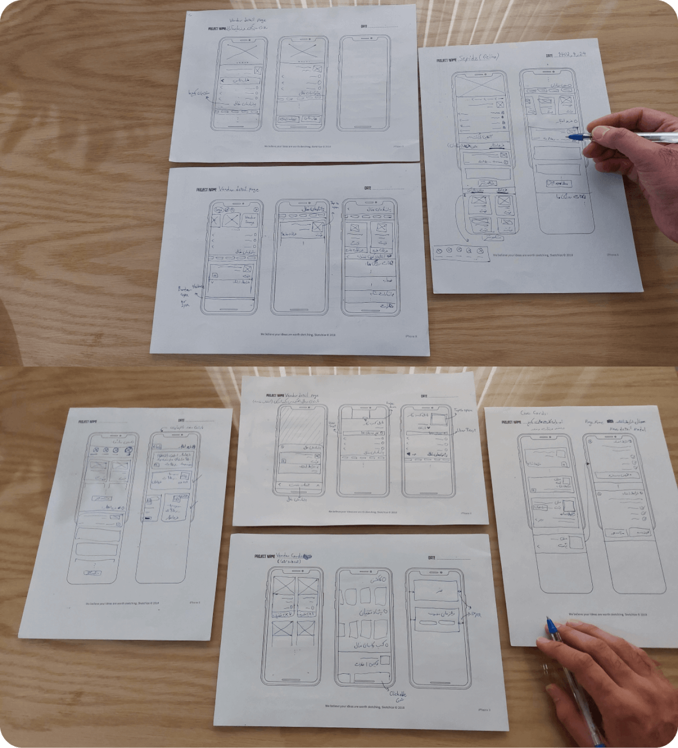
Early sketches
I began sketching to quickly visualize multiple ideas and focused on generating quantity over quality. Here are some of my early sketches:
Redesign and iterate
The final redesigns have gone through +20 iterations. Each iteration was reviewed with the team, resulting in improvements toward user experience and business goals.
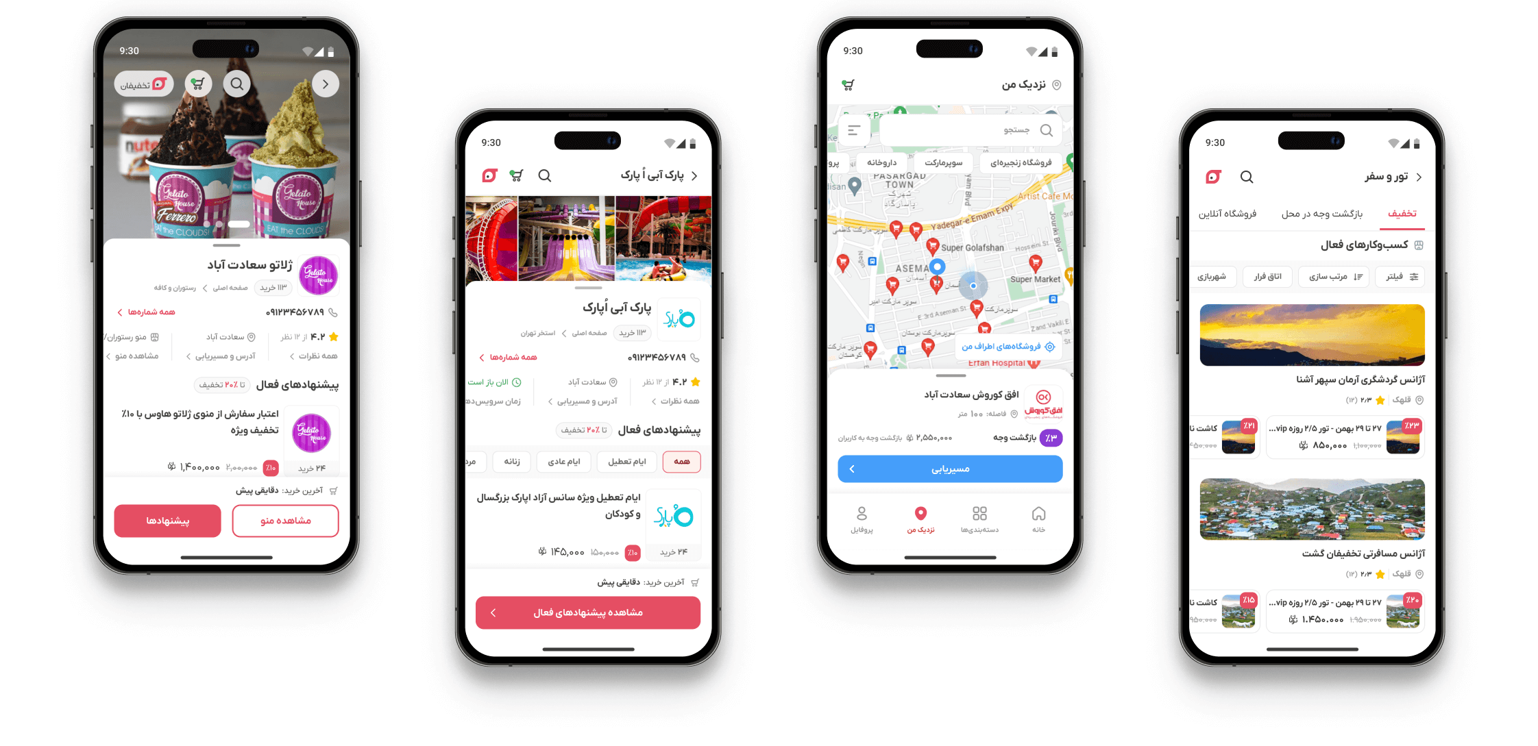
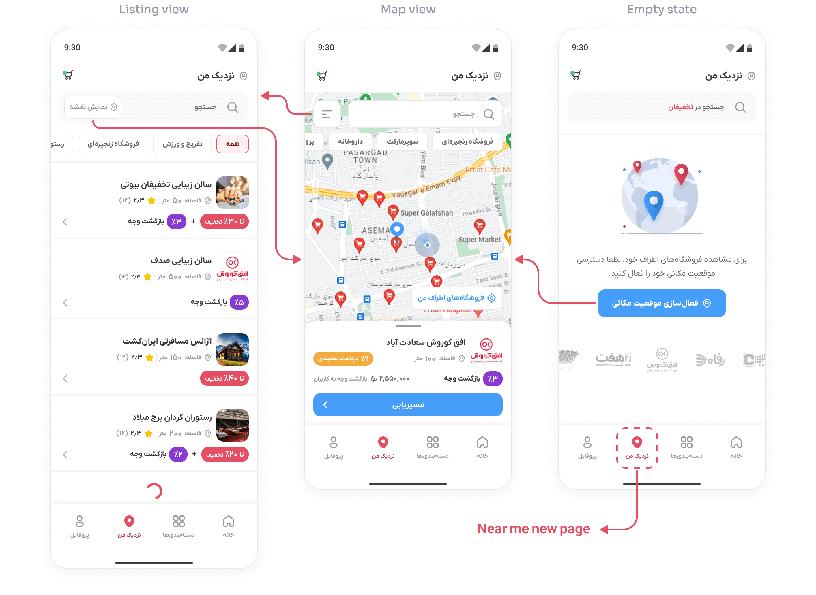
This new feature was implemented on a new page called “Near Me”, in addition to the category and search pages. Users can use their GPS location to see which vendors are near and what they offer by activating the device location.
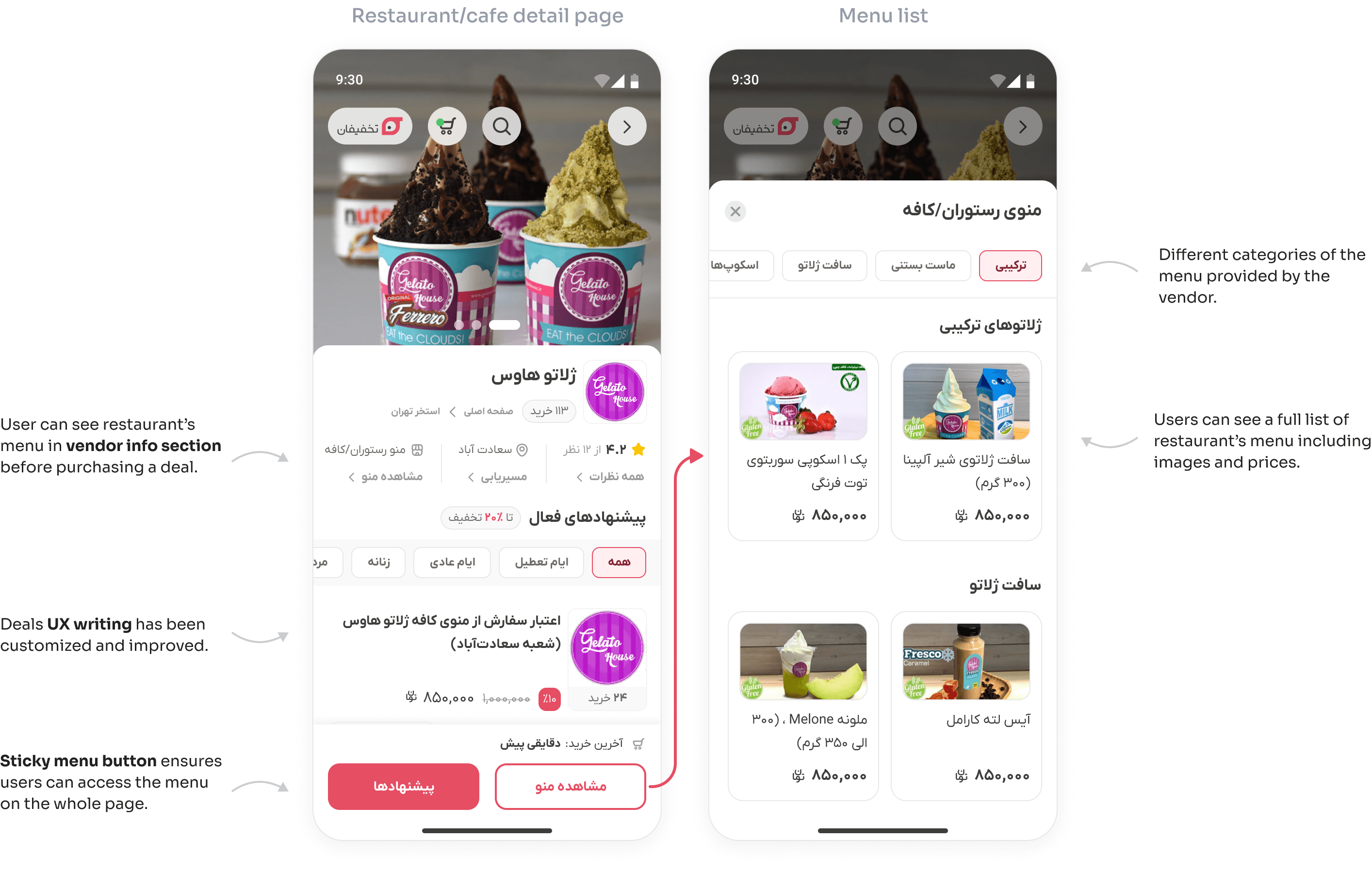
New feature: Restaurant & cafe menu
This particular feature was requested by both the business and users during the usability study. It was found that users preferred to view the complete menu of restaurants and cafes before making a purchase on the vendor detail page. We went through several iterations and after many improvements, this is the final version.
Insight 6: Clear feedback and copywriting
Error 500
Error 404
Impact
Data showed that compared with the previous version of “Category” and “Vendor detail pages”, new designs increased the overall conversion rate by +46.7% and reduced the average bounce rate by -22%.
+0%
Overall conversion rate
-0%
Average bounce rate
Lessons learned
Measure and improve continuously
In the course of revamping Takhfifan’s user experience, we learned the value of continuous data analysis and user feedback. Regular monitoring of product data, alongside frequent usability tests and user interviews, not only makes the redesign process more efficient but also better aligns our efforts with organizational goals, enhancing the overall user experience.”
Redesign and develop the changes step by step
Throughout the redesign process, we came to understand that implementing and developing changes incrementally is crucial. This approach significantly aided in achieving more precise and meaningful measurements of our progress towards the project’s objectives and goal.”
Align it with business objectives
During the research phase of any improvement and redesign project, various problems and issues may arise. However, it is crucial to align improvement priorities with business objectives.
Future works
Bug fixes
Many bugs were found and fixed, but there are definitely more bugs in other sections of the product that need further investigation and improvement.
Conduct more usability studies
To conduct more usability studies in short time intervals for better and more accurate investigation of product usability problems
Continue research and analyze data to design better experiences
Our work is not done here. Design is an iterative process and efforts to improve the user experience must be continuous.
Thank you for reading this case study till the end!